Monday, 28 November 2016

When UX is the King and Content is His Queen!


What is content strategy?

As a formal definition, we can say content strategy plans for the creation, delivery, and governance of useful, usable content.
Imagine a situation where the content is utterly confusing. Will it worth an amazing UX experience?
Well, the answer is a straight NO.  Even if your designers burn their midnight’s oil to deliver some aesthetically pleasing and functionally comfortable apps or platforms, the poor content will completely kill the user experience and satisfaction. Content Strategy is like a lady love to UX Design, who ensures that UX efforts are actually paid off by being a great couple duo.

Principles of content strategy

Content strategy generally works on the five principles of – Core Strategy, Substance, Structure, Workflow and Governance, as described by the framework of Melissa Rach, Vice President of Content Strategy in Bain Traffic.
With core strategy in the middle, substance and structure form the content components while workflow and governance are the people side of the content framework.


Core Strategy:

It generally starts with the core strategy which helps us to plan the content as per the business goals. During this stage we create a macro view of the content keeping the business ideas into perspective.

Substance:

Next we come to the planning and execution of the content. It starts with substance, which deals in detail about the messages, videos, text, picture that need to be implemented to make sure the core strategy is fulfilling the business objectives. Understanding the target users is very important to design the message architecture in the lines of the user tones and interests.

Structure:

Structures stems out of the information architecture phase of UX Design which focuses on how the content need to organized, prioritized and visible in front of the users. This structuring of the content determines which parts will be highlighted in front of the users and which parts need to be a bit subdued from the user’s interest and conversion point of view. You can check out Fortune Cookie UX Design to know how they conduct this stage for their clients.

Workflow:

In the third stage, we enter into the people side of the content strategy which divides the responsibility of managing the content and tools associated with it to different people. It starts with the users and goes to the internal team explaining the roles and responsibilities of each stakeholder to maintain the content workflow.

Governance:

Finally governance implies how the organization needs to map its policies and guidelines to the content and evolve them as they grow.

Content Strategy and UX!

Typically content strategy is not a part of the UX process; however a content strategist will ensure that the UX design is speaking the ideas in a proper manner.

UX and content don’t need to cling to each other, but they should definitely complement each other. The design needs to be done in a manner that the user can relate with the substance at one go. Similarly the content needs to be structured in a way which will actually make the user experience more pleasing and seamless.


Thursday, 24 November 2016

As India bids good bye to notes, let’s welcome Fintech


As Narendra Modi embraces cashless India with the recent ban on 500 and 1000 rupee notes, the payment banks and fintech startups are surely having a great Indian festival with the wallet deposits soaring high. This is surely one of the best times to promote cashless transactions and the perfect moment for the payment banks to grab the limelight yet again.

Time to bring back the attention to payment banks:

The payment bank dream went a bit haywire since these banks needed to invest 75 percent in Government securities and some were just not ready to accept this evolution of technology. With plastic money becoming one of the main sources of transaction, this concepts needs to buck up again. Moreover, with the license to issue ATM cards the payment banks fill in the gaps of liquidating the wallet balance any time for these mobile wallet companies.  When the main source of income for these payment banks come in the form of commission fees during third party transactions, the only way to sustain in this business model is by ensuring that the customers are doing enough cashless transactions. A customer will be convinced to use a payment bank or use a digital wallet to pay his regular cab fares, shopping bills, electricity bills and so on only if the process is smoother, easier and quicker than cash transactions. And, when we say an easier transaction process, we mean a smart user interface design.

How to ensure a better user experience for payment banks?

The core objective of payment banks is to push the concept of financial inclusion. When traditional banks can’t tap in the rural interiors, the payment banks can easily fill in these gaps with a deposit limit of 1 lakh rupees. So payment banks or mobile wallets need to be designed in a way such that it caters to the common Indian crowd. Let’s check out a few ways to make it work.

         Easy experience:
A farmer, who has no clue about online shopping sites and has just heard the name of whatsapp, needs to be introduced to this technology. The experience should be such that the functional elements are right in front of his eyes with an easy and simple navigation. The lesser the steps to complete a particular task, the easier it will be.

Content or Messaging:
The substance or the messaging has to be direct and pretty short. The key is to stick to a very simple language which is easily understandable and highlighted.

Quick navigation:
Internet connection is always an issue in India. The wallets need to be designed in a way such that it can work even when the internet connection is not that strong.  The user flow needs to be very quick and seamless to ensure the tasks are completed quickly.

         Local language:
When the app or wallet is targeted towards a large section of Indian crowd, local language is the trump card to win your users’ hearts. The apps should be in a way such that the users’ can relate with it in one go.

         Look and Feel:
The look and feel should be created in a manner such that it speaks the language of the local people.

Video and Images:
Text messaging can never be as eye-catching as videos or images. In fact, videos and images explain the concept in an easier way than text. After all pictures speak better than words.

Though it’s true it will take a long time for the payment banks to sip in the daily habits of the Indian citizens, we are not very far to this evolution with the government pushing it through various reforms and policies.

RBI has already granted license to 11 players. Among them four are in the telecom sectors. These telecom giants can easily tap in to a large number of users and when the target group includes every Indian citizen, the user experience has to very simple and direct.

Monday, 10 October 2016

Doing it the way the crowd does!

What do you mean by social proof?


“5Star rating? Wow this must be good!” 
A common human psychology when we buy products today. 

With every product and service available online, user experience and using the right psychological principle to motivate users to take action have become extremely important.

When buying a product users base their decisions on the buying behaviors of others and this particular psychological phenomenon is commonly known as ‘social proofing’. It’s a natural human tendency to avoid being the initiator.  People want validation for making a buying decision and it is important for designers to incorporate this behavior in their designs.  Social Proof has been identified in 1935 by Muzafer Sherif, a social psychologist through an experiment. The experiment proved that we tend to take up that action, which have been already taken up by others.

When you log in to a fashion site, you don’t get to touch and feel the dresses. On a food app, you can only see the menu of the restaurants, but have no clue about the quality of the food. Even on a travel website, you have to rely on the images (mostly photoshopped) to pick up a vacation destination or holiday resort. In such situations, we depend on the experience of other users or their feedback on any particular website or app. We tend to go for those things, where the users have already commented or rated and avoid being the initiator in online transaction. Social proof is gradually becoming a very important parameter in creating an emotional design, which establishes user faith on a particular product or service. We go by what the crowd says and it’s high time to get these social proofing elements at the correct places on a user interaction platform.


Why should you add social proofing in UX and interaction design?


The idea, that people are influenced by others decisions, has led to the implementation of social proof in interaction design patterns . Let’s look at the two ways in which this psychological phenomenon can influence user patterns:

  • ·         When you create an experience for your users, if your design layout includes features where there are evidences of social proofs, the conversions become doubled. If other people find an item good, we generally think it is more credible to buy. In fact, social proofs are better than advertisements since the end users get to see honest feedback from other end users directly.

·          
  • We are generally too shy when we have to start off a trend. Our general human psychology makes us more comfortable to adapt to the trends, which are already quite popular. Before you knew it Facebook and Twitter was all the rage and even our moms have become avid users. When Facebook and Twitter came, it was only a small percentage of the people who joined just to stay connected with old friends and to make new connections. But with the connections growing, more people joined in. It just became an exponential growth for these social media sites since the ones who were left behind thought they are missing out to be the part of the latest trends. 


How you can add social proofs to your UX design?

Social proof needs to be seamlessly integrated into the interaction design patterns. Adding the right social cues at the right places in the interface enhances trust and credibility. If the design elements become too loud, then the user will feel these buttons are sponsored links. On the other hand, if it is hidden behind your regular menu bars and attractive images, customers will be disappointed on not finding the social proof triggers. Striking a balance between the two is an art and you can achieve that by following some of these popular social proofing techniques in UX design -

Ratings and Reviews:

Before buying any item on Amazon or Flipkart, checking out the ratings and reviews is a must. With ecommerce booming, users were not able to see and feel any item. They have started relying a lot on what other people thought about an item and most of the buying decisions are based on it.

Zomato, another name in this regard, is our reliable guide when it comes to going to restaurants. The ratings and reviews on Zomato are extremely critical and restaurants with low ratings get very less crowd. Ratings and reviews have become the important elements to create emotional design on a user interface.

Social Shares and likes:

If an article or any product gets a lot of shares and likes from other people, it spreads virally on social media. Content which are most liked and shared keep on coming back on your wall, because Facebook also believes in social proof. If an article is not having enough shares, we are always skeptical about commenting or liking it, no matter how good it is. And, not to mention how SEO loves popular content.

Count buttons:

Give your users a real time count on your number of subscribers, clients, followers and so much more. Keep the buttons dynamic, it gives the users an impression that the numbers are increasing every second.

Behavior filters:

Track your users’ journey on your website and open an option of “Customer who bought this also viewed – “. So if a lady is planning to buy a top, show her some bottom wear, which were seen by the customers who bought the top. She might end up buying a bottom wear as an impulsive shopper, just to match with her top.

Testimonials:

Social proof is incomplete without testimonials. This is very effective in service related websites and edutech apps, beauty and salon services etc.

Client Logos:

Presence of client logos on websites showcases affiliations with well-known organizations. This will help to instill customer faith on the organization.


Creating these social elements and displaying them strategically on the interfaces require an edge for design and proper learning sessions. ImaginXP offers various courses on UX design which help to instill the psychological element in user interfaces. 

Designing is incomplete without UX today and it’s high time for all the designers to adopt these skills to ensure a more credible user experience.

Sunday, 3 July 2016

6 Interaction Design principles for great design

Interaction design, also known as IxD, is the process of creating a user-friendly, digital product that will delight users and lead to creating a loyal user base for the product. An interaction designer has to ensure that the layout of a digital product be it on web, mobile, wearbales or whatever comes next helps a user easily navigate and interact with a product without confusing or frustrating him. The idea is to help them achieve their goals with minimal difficulty.

Here are 6 interaction design principles that will help you design easy-to-use, functional and valuable products.
1.    Maintain Consistency in Interaction Patterns


A product design that confuses the user is never a good one.
Sometimes, while designing a product interface, you may find the urge to break stereotypes and do something different. This may work if you’re offering a new, unconventional service but not in the case of established interaction patterns. Your users shouldn’t be questioning functions rather they should be able to easily interact with the interface. Use designs and patterns that the user expects, and can easily understand, across all your services and products.

2.    Don’t Overly Complicate Or Simplify


When you’re designing an interaction, it’s important to bear in mind that too many functions will confuse the user. Keep the design clutter-free and focus more on the primary functions that will help the user access key functionality and features. On the other hand, if you take an extremely minimalistic approach, you might not include some vital functions in the interface.
The key to a good design is to create an engaging interface that’s not overly complicated or too simplistic.
3.    Don’t Make The User Think


Steve Krug, a user experience professional, states in his book “Don’t Make Me Think” that a user shouldn’t be left to predict how a function works. As a designer, you should ensure that a user can understand the interface like the back of his hand. Use icons, layouts, and designs that they are familiar with, and can easily comprehend. This way, you will be able to keep your users engaged with your product. 

4.    Prioritize Based on Product Functionality


In the case of interaction design, the Pareto principle (or the 80-20 rule) lays emphasis on “20% of the functions that are used 80% of the time.”
This means your interactions should focus on those functionalities that are more likely to be used than the advanced ones. Design the interaction in a way that it allows beginners to easily navigate to advanced functions and not overwhelm them in the first instance.
5.    Design for Easy Affordance


The affordance of an object is its ability to hint at how it should be used. A simple example would be the ‘Add to cart’ button that you click on when you’re shopping online, which clearly defines for a user what the expected action is.
When building affordance for a digital product, you have to make sure that a user can easily understand how different functions work. They shouldn’t be hovering over an icon, wondering what it will entail. Instead, they should be able to immediately understand what the function will do, and how they should use it. 
6.    Always Start with Information Architecture


Information Architecture (IA) is crucial when you’re designing any kind of digital product. It involves creating site maps, hierarchies, navigations, categories and nomenclature. An interaction designer creates the IA for a digital product so that he can define how users will navigate across the product and where the functions should be placed. Since this is the most important base of your design, you should start with information architecture before going ahead with other design strategies.


These are some of the basic principles that will help you design well structured and user-friendly interactions. To sum it up, first, have the information architecture in place and then ensure that you maintain consistency in your design patterns. Keep the design engaging but not too complicated and never make the user think unnecessarily about how the interface works. Lastly, make sure that the core functions are given the most importance and the interface has good affordance built into it.

Monday, 25 January 2016

Why Great UX Is Incomplete Without Security

UX is diverse and it is common to find everyone gushing about the look, the feel and aesthetics of a design to entice & impress users.

Great UX Security
Great UX and Security Go Hand in Hand
But one aspect that is hardly spoken about is security. 

It might sound a bit odd to talk about UX and security in the same breath but it is undeniable that both can co-exist.

For example, how often have you seen the “strength scale” of the password that shows something like “weak, good, strong” to show what type your password fits in.

So how does one, as a UX designer, smoothly integrate security as a part of the UX design?

It is every UX designer’s dream to create a pleasant user experience for the users. But what does not cross one’s mind as a first thought is the security aspect of the design.

Lack of security indicators within a design is a huge hindrance in delivering a positive user experience. It makes the user skeptical and more often than not turns them off simply because they cannot trust the site.

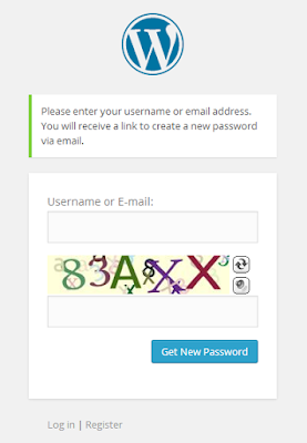
Security is something that gives the user a sense of belief that his privacy is respected. One of the best examples of why security should be an inseparable part of UX is the CAPTCHA.
User trust in UX
Great UX is incomplete without security
CAPTCHA is security measure implemented by websites to ensure that the end user is human and not some robot. Similarly, when there are security measures within a UX design, as simple as a security badge from authority, it can be a great trust builder which could lead to positive user experience.

 Consumers have become smarter and hence the UX Design too needs to cater to it in 2016

Another example that is the Touch ID feature in i Phones which we first we saw in 5S model. It cannot be denied that this feature is one of the major contributors to positive user experience of iPhone users. This has in turn meant more sales which meant fatter bottom line for corporate like Apple

Why? Because it relieves the users from constantly worrying about someone gaining unwarranted access to the phone and stealing their personal.

There are many more reasons why security should be on top of a UX designer’s mind. There is interesting take on how security can be integrated into UX to enhance the overall impact of the product that is being used. You can read it here.

So what do you think about security in UX design and at what stage should one consider it?

Leave your comments below.